
Send this article to a friend:
December
16
2017

|
Send this article to a friend: December |
|
Long Term Patterns in Stocks, Gold and Crude
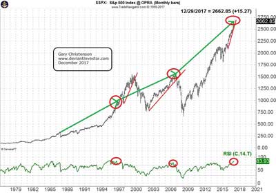
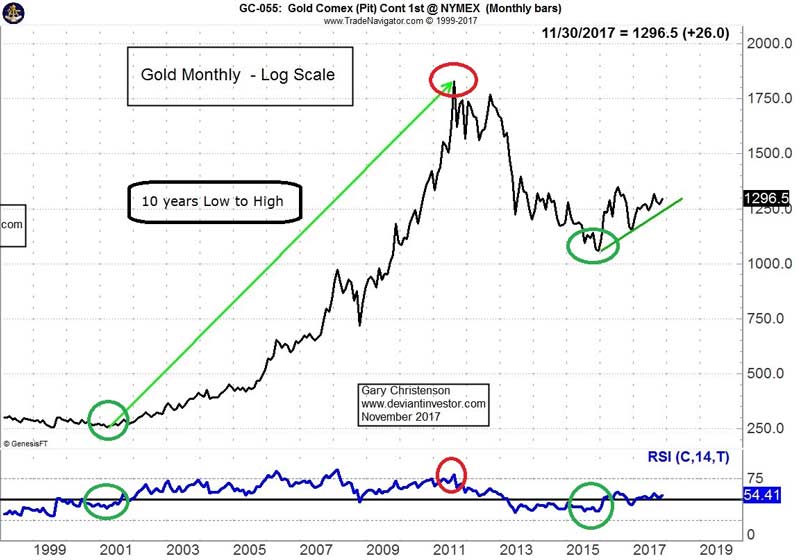
The green arrows are 10 years long. Peaks indicated are in 1987, 2007, and potentially 2017. The pause in 1997 was not a top because the market rally extended into early 2000. The current peak in 2017 could also extend, but valuation and timing indicators show high risk. When the monthly RSI (timing indicator at bottom of graph) exceeds 70, turns down, and prices fall below the red support line, a significant correction or crash is possible. Those crashes occurred in 1987, 2000, and 2008. The S&P is ready to make a similar correction or crash in 2017 or 2018. The RSI has reached its highest level in two decades. The S&P 500 Index, DOW, NASDAQ, DAX and many other indices are excessively high, thanks to central bank “stimulus” and QE policies. The monthly chart of the S&P shows S&P prices are in a high risk danger zone. Possible tops have occurred before, but instead of crashing, the market sometimes zoomed higher. Do you own due diligence. Also, read “Hindenburg Omen Meets Titanic Syndrome.” However, if you want to believe the S&P is going higher, read “Stock Market Crash … Another Lie.” The Gold Market and its 10 year pattern The gold market has an approximate 10 year low to high pattern.
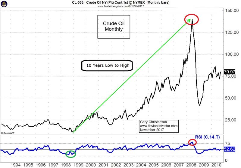
Gold: 2001 – 2011 The dashed green arrow shows that gold bottomed in April 2001 and peaked in August 2011, ten years later. Gold prices bottomed in late 2015 and could rally for many years. Gold: 1970 – 1980 & 1982 – 1993 Gold sold for about $35 per ounce in 1970, although the market was controlled. In January 1980, ten years later, it sold for over $850. Gold prices crashed to a low in June 1982 and eleven years later they peaked in August 1993. A ten year low to high pattern, beginning with the late 2015 low in gold prices, suggests a gold price high during the middle of the next decade. The Crude Oil Market 1998 – 2008 Crude oil prices bottomed in 1998 at under $11.00 and rose to nearly $150 per barrel in 2008, ten years later.
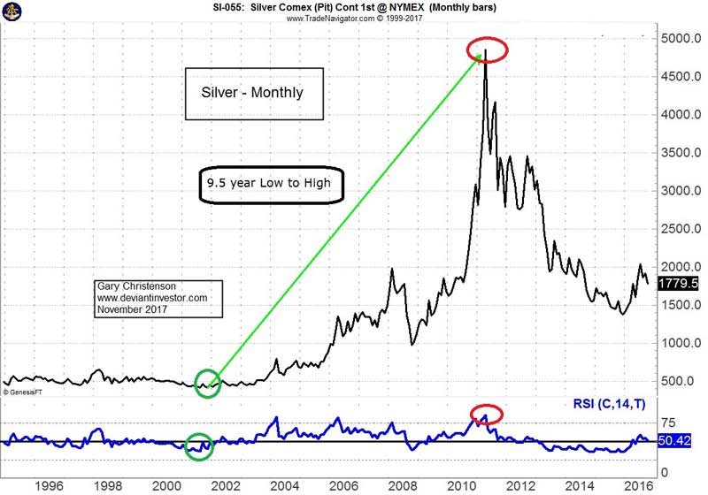
The Silver Market – Same 10 year pattern as goldSilver prices have a 10 year low to high pattern similar to gold.
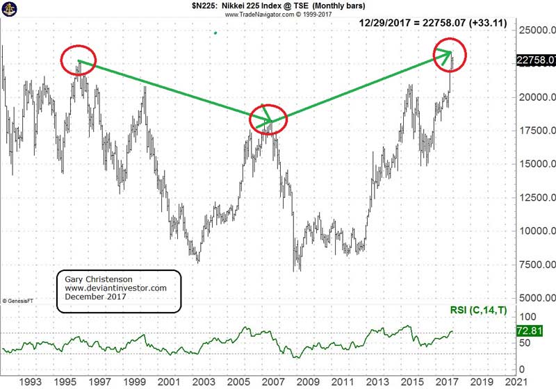
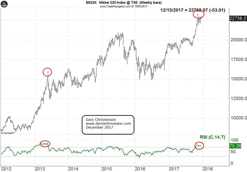
Silver prices bottomed in November 2001 and rallied from $4.01 to over $48 in April 2011, about 9.5 years. Silver prices bottomed again in December 2015. A nine to ten year low to high pattern suggests a high well into the next decade. Given the exponential increases in global debt and increasing consumer prices, the coming silver and gold highs could be many times larger than today’s relatively inexpensive prices of about $1,250 for gold and $16.00 for silver. The Nikkei 225 IndexThe Japanese Nikkei 225 Index shows a pattern similar to the S&P 500 and DOW Index. The Nikkei peaked in mid-2007 and has rallied, in part due to purchases by the Japanese Central Bank, into late 2017. We shall see if 2017 is a lasting high. The weekly chart (shown below) indicates a possible rollover in prices and RSI.
Total Debt Securities The St. Louis Federal Reserve publishes data for total debt securities in the United States. In 1971 President Nixon severed the last connection between gold and the U.S. dollar, which encouraged expansion of currency in circulation, debt, and continual devaluation of the dollar.
The pattern for total debt is simple: Up, Up, and Up. This makes the pattern for the dollar’s purchasing power equally obvious: Down, Down, and Down. SO WHAT?
CONCLUSIONS:
Gary Christenson The Deviant Investor
|
Send this article to a friend:
 |
 |
 |

![[Most Recent Quotes from www.kitco.com]](http://www.kitconet.com/charts/metals/gold/t24_au_en_usoz_2.gif)
![[Most Recent USD from www.kitco.com]](http://www.weblinks247.com/indexes/idx24_usd_en_2.gif)
![[Most Recent Quotes from www.kitco.com]](http://www.kitconet.com/charts/metals/silver/t24_ag_en_usoz_2.gif)