
Send this article to a friend:
February
06
2020

|
Send this article to a friend: February |
|
How are Stocks Going Up While Earnings Go Down?
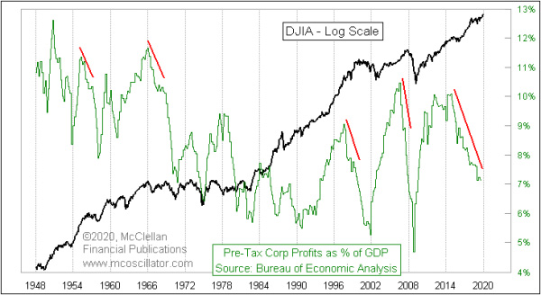
This week’s chart looks at some data which is buried deep within the Bureau of Economic Analysis’ report on National Income and Product Accounts. You can find it here, then go to table 1.10, line 15. Like I said, it is deep. What it reflects is total pre-tax corporate profits for all corporations in the U.S., not just those in the SP500 or any other index of public companies. I go the further step of dividing it by GDP to create the plot you see here.
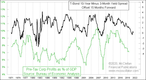
The interesting revelation is that the Fed’s QE programs were supposed to help boost the actual economy, but it did not really work. What happened instead was that all of the money-printing boosted stock prices, which is great for investors. But it did not flow through to the “real” economy. Normally when there is a divergence between stock prices going higher and earnings going lower (as a % of GDP), that is a setup for an important top for stock prices. The timeframe over which such divergences tend to matter is usually around 1-3 years. So it is “irregular” that this divergence has been going on for 5+ years now, and we are still waiting for it to matter. President Trump and Congress pushed through a package of tax cuts and regulatory reform in 2017, and that has demonstrably helped the stock market as well as the unemployment rate, which remains at 3.5%, a multi-decade low. But it did not do anything to change the slope of the downtrend in corporate profits. So why is that? Why didn’t the tax cuts help overall corporate profits? The answer lies in this next chart, which looks at this same plot of corporate profits and compares it this time to the spread between 10-year and 3-month Treasury yields.
I wrote about how that yield spread tends to give a 15-month leading indication for the relative performance of small caps vs. large caps, and for the future of GDP growth. So it is no surprise that a flattening (or inverted) yield curve also has an effect on corporate profits. If the Fed wants to get corporate profits up (and they likely do not, ahead of a presidential election), they need to lower short-term rates to disinvert the yield curve. And then wait 15 months. From the beginning of this data series on corporate profits in 1947 until now, the average reading is 8.5%. So the current 7.1% reading is below average. And that is relevant because below average readings tend to lead to bottoms for earnings, and those bottoms do tend to lead to big up moves for stock prices. So this is definitely irregular behavior to see the earnings rate heading for a bottom, while stock prices are not showing anything like historic bottoming behavior. Making new highs is a peculiar way to be approaching a “bottom” for stock prices. So how can we understand this irregular stock market behavior? I like to say that when it comes to the overall stock market, there are only 2 “fundamentals” that matter: (1) How much money is there? and (2) How much does that money want to be invested? As long as the Fed keeps goosing the economy with additional money, factor #1 keeps working in the bulls’ favor. Maybe someday there will be new leadership at the Fed who decide that continually pumping money into the banking system to prop up the stock market is not a good idea. But for now, we are stuck with a Fed staff who print money, and insist that it is “not QE”. Investors should adapt themselves to the market they face, and not the market they would like to have. And investors who want to win at this game should attune themselves to how much intervention the Fed is engaged in. This has been an important topic lately in our Daily Edition. Recent issues have focused on how the Fed’s activity in the market for “repurchase agreements”, or “repos”, is having an enormous effect on the behavior of stock prices, outweighing other factors like seasonality and sentiment.
Tom is a graduate of the U.S. Military Academy at West Point where he studied aerospace engineering, and he served as an Army helicopter pilot for 11 years. He began his own study of market technical analysis while still in the Army, and discovered ways to expand the use of his parents' indicators to forecast future market turning points. Tom views the movements of prices in the financial market through the eyes of an engineer, which allows him to focus on what the data really say rather than interpreting events according to the same "conventional wisdom" used by other analysts. In 1993, he left the Army to join his father in pursuing a new career doing this type of analysis. Tom and Sherman spent the next 2 years refining their analysis techniques and laying groundwork. In April 1995 they launched their newsletter, The McClellan Market Report, an 8 page report covering the stock, bond, and gold markets, which is published twice a month. They utilize the unique indicators they have developed to present their view of the market's structure as well as their forecasts for future trend direction and the timing of turning points. A Daily Edition was added in February 1998 to give subscribers daily updates on their indicators and also provide market position indications for stocks, bonds and gold. Their subscribers range from individual investors to professional fund managers. Tom serves as editor of both publications, and runs the newsletter business from its location in Lakewood, WA.
www.mcoscillator.com
|
Send this article to a friend:
 |
 |
 |

![[Most Recent Quotes from www.kitco.com]](http://www.kitconet.com/images/live/s_gold.gif)
![[Most Recent USD from www.kitco.com]](http://www.weblinks247.com/indexes/idx24_usd_en_2.gif)
![[Most Recent Quotes from www.kitco.com]](http://www.kitconet.com/images/live/s_silv.gif)