Stocks, the Economy and the Money Supply – What to Watch
Pater Tenebrarum
 The Stock Market and Economic Data The Stock Market and Economic Data
In previous articles we have occasionally discussed the interaction between economic indicators and the stock market. Among the topics we have touched upon: for one thing, the capitalization-weighted indexes can hardly be called “leading indicators” of the economy anymore. In fact, if one studies specific major turning points over the past two decades or so, it is clear that the market seems to “know” very little (at least not in advance).
The impression one gets is actually that the major indexes are acting like coincident rather than leading indicators of the economy. However, the market is not completely bereft of leading indicator qualities. What seems to be leading the economy are not the cap-weighted indexes, but market internals.
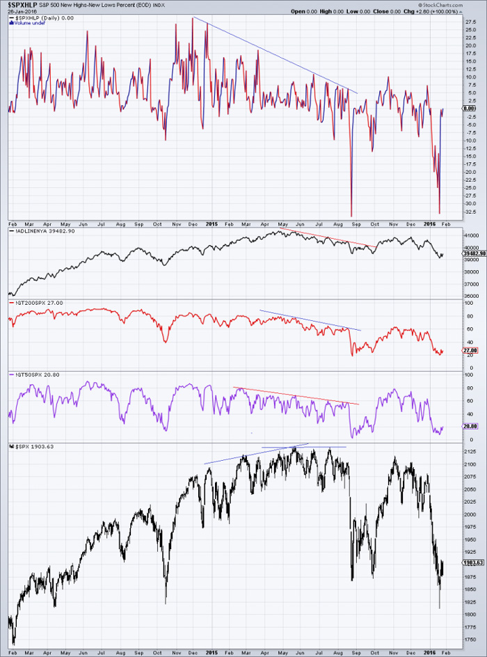
Even while the SPX still rose, resp. went sideways in 2015, market internals began to deteriorate (here shown: S&P hi/low percent, NYSE a/d line, SPX stocks above 200 & 50 day ma) – click to enlarge.
We believe we can explain why this is the case. In an economy in which the money supply can be expanded ex nihilo by central planners and/or commercial banks, the pace of money supply growth tends to lead both stock market returns and the performance of the economy as measured in terms of aggregate data.
Readers may have noticed our habit of adding the qualifier “as measured by aggregate data”. We are doing this because the boom period is a kind of Potemkin village: seemingly busy economic activity and surging accounting profits are masking the fact that a great deal of capital is consumed. Simply put, accounts are falsified, because loose monetary policy distorts and falsifies the entire economy’s price structure.
Due to the modus operandi of central banks and the growing popularity of all sorts of financial engineering strategies, financial asset prices are these days the greatest beneficiaries of monetary inflation. Once the pace of inflation begins to slow down, a difficulty presents itself that is first noticed in financial markets. The reduced flow of additional money means that parts of the bubble have to be abandoned – there is no longer enough “juice” to lift all the boats.
An internal shift takes place at that point: investors begin to sell less liquid stocks and move their funds into liquid big cap stocks, preferably those with a good “growth story”. We have seen yet another example of this behavior last year: already extremely overvalued big caps (i.e., the so-called “FANGs”) advanced strongly, while the vast majority of stocks came under varying degrees of pressure at the same time. The result was a sideways move in the popular indexes which superficially suggested that everything was fine, while large swathes of the market crumbled underneath the tranquility.
Another topic we discussed was the fact that the yield curve loses part of its traditional signaling function once a zero interest policy has been adopted. In short, one can no longer rely on a yield curve inversion to warn of impending trouble in the stock market and the economy. A mere flattening of the curve is likely all one is going to get (see “The Yield Curve and Recessions”, where we inter alia showed a chart of Japan’s yield curve and recessions since the late 1980s).
One interaction we have mentioned a few times is the pronounced inverse correlation between the stock market and initial unemployment claims. John Hussman discusses initial claims in this week’s market report, mainly in connection with their usefulness as a recession indicator (and by inference, a stock market indicator). He mentions an interesting empirical datum in this context:
“On the economic front, I continue to believe that a U.S. recession is not only a risk, but is now the most probable outcome. As I noted last week, among confirming indicators that generally emerge fairly early once a recession has taken hold, we would be particularly attentive to the following: a sudden drop in consumer confidence about 20 points below its 12-month average (which would currently equate to a drop to the 75 level on the Conference Board measure), a decline in aggregate hours worked below its level 3-months prior, a year-over-year increase of about 20% in new claims for unemployment (which would currently equate to a level of about 340,000 weekly new claims), and slowing growth in real personal income.
Last week, new claims for unemployment jumped to 293,000, a level we’ve observed only once since last April. Even at this early point (given that employment measures are among the most lagging economic indicators), we already observe a pickup in claims from last year’s lows. To put this increase into perspective, the chart below shows points where the ISM Purchasing Managers Index was below 50, the S&P 500 was below its level of 6 months prior, and the 4-week average of initial unemployment claims was at least 5% above its 12-month low. While a year-over-year increase in unemployment claims closer to 20% would be a more reliable confirmation of recession, it’s clear that even here, the current combination of evidence is more associated with recession than not.”
(emphasis added).
Here is a chart illustrating the inverse correlation between the S&P 500 Index and initial claims:
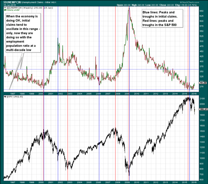
Initial claims and the SPX: major turning points in claims are highlighted in blue, and major turning points in stocks in red. These tend to be very close together – 2001/2 was an exception, but even on that occasion interim peaks and troughs showed close alignment. Note: in 2007, claims made a secondary low concurrently with the stock market’s peak, while the initial slightly lower low in claims in 2006 occurred fairly close to the peak of the housing boom (there was brief spike due to hurricane Kathrina in 2005 one has to ignore as exogenous).
The next chart shows a close-up of initial claims over the past year. The current level does not yet appear to be a decisive signal (as Mr. Hussman mentions, in the past a 20% surge off the low usually coincided with the beginning of recessions), but a trend change could well be underway:
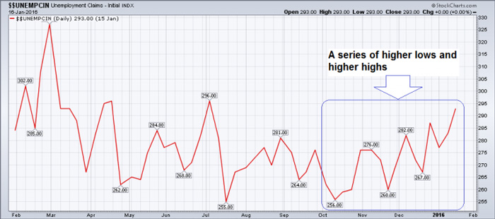
A slow uptrend in initial unemployment claims has begun to emerge in recent months.
We would say that while the trend change is not yet firmly established, this does look a bit suspicious – especially in light of assorted economic data releases over the past few months and the recent behavior of the stock market.
The Monetary Backdrop
Given the central role money supply growth is playing in driving the boom-bust cycle, one needs to keep a close eye on it. The broad money measure TMS-2 has recently been updated to December, and it can be seen that there has been a notable spike over the past two months – which has driven the year-on-year growth rate back up to a hefty 8.45%.
The main drivers of this spike are the Treasury’s general account with the Fed, which has increased rapidly since the end of October. We are not sure why it has been growing so fast of late, but will report back if we manage to find out. The other driver was a year-end spike in demand deposits – which has since then been given back, see also the comments on M1 further below.
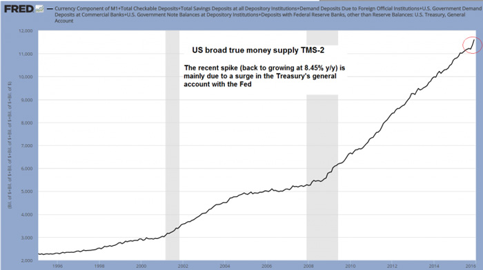
US broad money supply TMS-2 – a spike in November-December 2015. The treasury’s general account has been rising strongly since the end of October, and in December demand deposits also rose sharply (at a 15% y/y rate.
A similar year-end spike occurred in the narrow money measure M1 as well (due to the sudden surge in demand deposits). While we aren’t entirely sure, it seems quite possible that year-end balance sheet window dressing activities by banks and/or MMFs, or other businesses may have something to do with these gyrations (a similarity to the big surge in year-end reverse repo transactions). These may for instance involve temporary repatriation of dollars held in accounts abroad, which would certainly tend to add to the domestic money supply.
M1 is reported quite timely on a weekly basis, and in early January its y/y growth rate has fallen back to the low end of its recent range, which cements this suspicion (demand deposit growth fell from 15% y/y at the end of December to 5% as of mid January). A similar move will likely be visible in TMS-2 once the next update including January becomes available (some of its components are only updated monthly with a three week lag).
We intend to replace M1 with charts of TMS-1 and AMS soon, but for a quick look at the portion of the money supply that consists primarily of what we would term “transactional money”, M1 will actually do for now. A large component of TMS-2 consists of savings deposits, on the grounds that they are de facto redeemable for standard money (banknotes) at par on demand, but these deposits are obviously far less often used in transactions than demand deposits (a side note: M1 also includes traveler checks, which are clearly not money, but the amount is by now so tiny that it can basically be ignored).
Here is a chart of the y/y M1 growth rate – as can be seen, the overarching downtrend remains firmly in place:
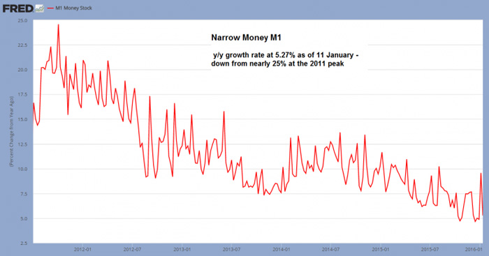
M1 y/y growth rate: back at the low end of the recent range, and down a lot from the peak growth rate in late 2011.
Narrow money growth is likely to lead TMS-2 growth and its decline from a nearly 25% growth rate at the 2011 peak to less than 6% today strikes us as quite significant. It does indeed appear as though the bubble is “running out of juice”.
The same is not true in the euro area (TMS growth of +14% y/y), but as we have previously pointed out, we believe US money supply growth rates to be more important for global asset prices, due to a variety of feedback effects (recent developments in global stock markets seem to be confirming this so far).
Conclusion
Initial claims are creeping closer to the level at which they will give both a recession and a bear market signal. These data should be watched very closely over coming weeks. The stock market has already given a number of signals typically associated with a major trend change (apart from market internals, there is e.g. also the ominous peak in margin debt on April 2015, which hasn’t been exceeded since).
Lastly, although TMS-2 growth has re-accelerated after seemingly breaking down last October, this seems mainly due to one-off effects, some of which are reversing already. Narrow money growth has already slowed a great deal more, and the late December spike was evidently a fluke. Once money supply inflation slows sufficiently, all bubble activities are doomed.
Charts by: StockCharts, St. Louis Federal Reserve Research
Pater Tenebrarum is an independent analyst and economist/social theorist. He has been involved with financial markets in various capacities for 39 years and currently writes economic and market analyses for independent research organizations and a European hedge fund consultancy as well as being the main author of the acting-man blog.
www.acting-man.com |


