August
8
2013
8
2013
|
August 8 2013 |
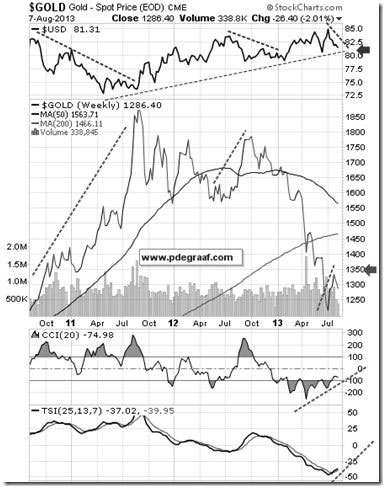
The two most important charts you're likely to see all day.
The two most important charts you're likely to see all day. Featured on the left below is the weekly gold chart, with the US dollar at the top. The rising dotted lines in the gold chart coincide with falling dotted lines in the US dollar index chart. The long uptrend line supporting the dollar coincides with the latest correction in the gold price. The arrow in the dollar chart points to a possible breakdown below the rising trend-line in the dollar (once price drops below the arrow). In the event that this occurs, it is very likely to coincide with the gold price rising above the arrow in the gold chart. The supporting indicators at the bottom of the chart are turning positive. (Chart courtesy Stockcharts.com)
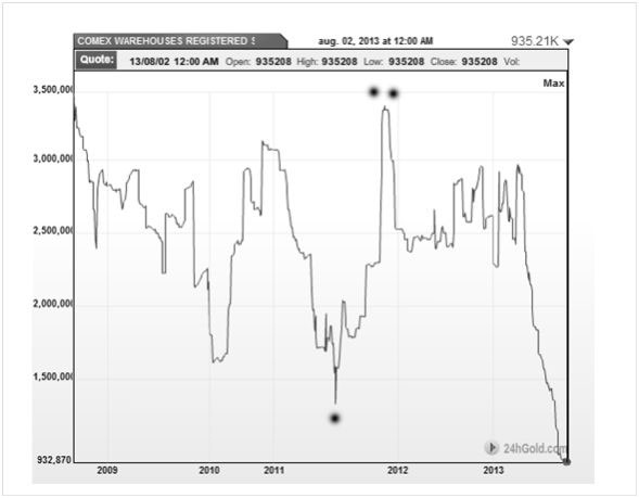
Notice how the previous low in this chart in mid- 2011 (single dot), coincided with the gold price bottoming at $1500 and subsequently rising to $1915. The high point in this chart at the end of 2011 (two dots), coincided with the gold price topping out at $1915.
Peter Degraaf is an online stocks and bullion investor with over 50 years of investing experience. He produces a daily report for his many subscribers. To receive a sample copy of a recent report, send him an Email [email protected] or visit his website www.pdegraaf.com. Disclaimer: Please do your own due diligence. I am not responsible for your trading decisions. Investing involves risk. |
|---|
Send this article to a friend:
 |
 |
 |