
Send this article to a friend:
July
19
2021

|
Send this article to a friend: July |
|
What Triggered the Crash?
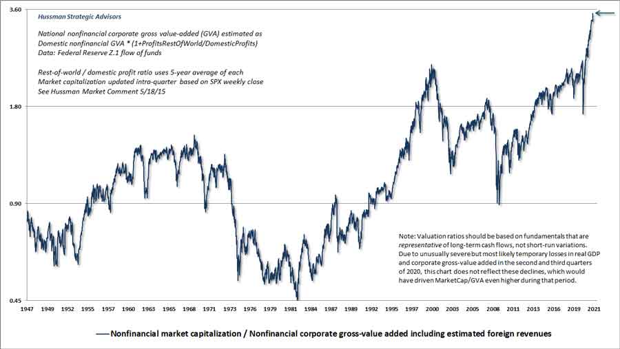
The title of this comment may seem odd, given that – as I write this on July 14, 2021 – the S&P 500 is at a record high. Indeed, based on the measures we find best-correlated with actual subsequent market returns, stock market valuations are easily beyond every level in history, including the 1929 and 2000 extremes. Of course, that’s exactly the point. While our investment discipline is to align our investment stance with observable market conditions, and requires no “forecasts,” I consider prevailing conditions to be strikingly hostile. The first passage of the Galbraith quote above is from his 1990 book, A Short History of Financial Euphoria. The second is from his 1954 book, The Great Crash, 1929. If investors need one thing at this moment, it is the perspective of market history. When the time comes to ask the question – “What triggered the crash?” – remember that this is the least important question. A market crash requires nothing more than a shift in investor psychology from careless speculation to even modest risk-aversion. A market crash requires nothing more than an increase in the risk premium demanded by investors, in an environment where risk premiums have become overly depressed. At some point, enough investors stop basing their expectations for future returns on the mindless extrapolation of past returns, in a market where prices have become detached from fundamentals. At some point, investors discover a basic fact of equilibrium: it is impossible, in aggregate, for investors to “exit” the market. Every single share of stock that has been issued has to be held by some investor, at every moment in time, until it is retired. Lost in the incoherent blather about “cash on the sidelines,” “money flowing into the market,” and liquidity needing to “find a home,” there is a basic fact of equilibrium: once a security has been issued, it has to be held by someone, exactly in the form it was issued, until it is retired. Every dollar bill. Every share of stock. Every bond certificate. All of them are already home. They can’t magically turn into something else. Not a single dollar comes “into” the stock market that does not simultaneously come “out.” Not a single share is purchased that is not simultaneously sold. Every eager buyer must find a seller. Every eager seller must find a buyer. Either way, the buying always equals the selling. It’s not “money flow” that moves prices around. It’s eagerness. With valuations at the most extreme level in history, the one thing that the market simply cannot tolerate is the eager attempt of a substantial number of investors to exit. When the walls come down, investors will scavenge the news for “catalysts.” Don’t fall into this trap. Undoubtedly, some “catalyst” will be found, but the mistake will be in believing that the collapse is caused by that piece of “bad” news. The important question to ask is “What drove the bubble?” That’s where the lessons are. The root causes of a crash are always the factors that nurtured and encouraged the “happy” period of carefree and irresponsible speculation that led to the bubble extreme. The chart below shows the ratio of nonfinancial market capitalization to corporate gross value-added, including estimated foreign revenues. I introduced MarketCap/GVA in 2015, and it remains more strongly correlated with actual subsequent market returns than any other measure we’ve tested or introduced. The chart is on log scale. Trust me. Unless you’re neutral or short, you don’t want to see what this chart looks like not on log scale.
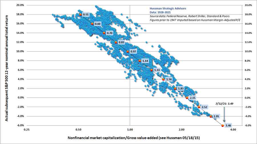
The scatter below extends the history back to 1928 based on the closely proportionate relationship between this measure and another reliable metric, our Margin Adjusted P/E. Valuation is shown on the horizontal axis (log scale). Actual subsequent 12-year S&P 500 nominal total returns are shown on the vertical axis. We don’t yet know the 12-year return that will follow the current point. We do know that investors will need to enjoy a fairy optimistic “error” simply to get a 12-year return of zero.
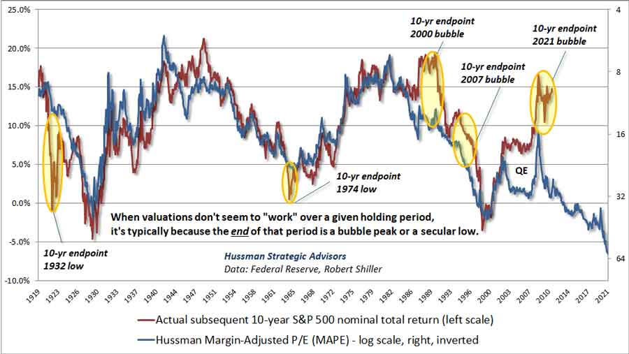
When valuations don’t seem to “work” Valuations are extremely informative about long-term investment returns (particularly over 10-12 year horizons) and the extent of potential market losses over the completion of the market cycle. However, valuations often have very little relationship to market fluctuations over shorter segments of the market cycle. Those shorter fluctuations are far more dependent on whether investors are inclined toward speculation or risk-aversion, and our most reliable gauge of that is uniformity or divergence across a broad range of market internals. Yet even when we examine 10-12 year market returns, there are occasionally periods when valuations simply don’t seem to “work.” These periods have an unfortunate impact on investor psychology. If the market has advanced for quite some time, despite extreme valuations, investors can conclude – at the worst moment possible – that valuations don’t matter and prices can advance indefinitely. Likewise, if the market has declined far beyond the level justified by valuations, investors can conclude – again at the worst moment possible – that valuations don’t matter and there simply is no bottom. When we compare actual 10-year S&P 500 total returns across history with the total returns implied by our most reliable valuation measures, we see several “errors” where actual returns over the next 10 years were either well-above or well-below expectations. Ranked by size, the largest errors include: 1922 (below expectations), 2011 (above), 1990 (above), 1964 (below), and 1997 (above). What’s so special about those particular 10-year periods? Simple. Just add 10 years. The 1922 “error” corresponds to the 10-year period ending at the 1932 depression low. The 2011 “error” corresponds to the current market extreme. The 1990 “error” corresponds to the 2000 tech bubble peak. The 1964 “error” corresponds to the 1974 secular valuation low, and the 1997 “error” corresponds to the 2007 mortgage bubble peak that preceded the global financial crisis. Quite simply, when you observe a period where valuations haven’t “worked” in a significant way, you should be either very concerned, or very enthusiastic, because it most likely means that market valuations are at either a bubble peak or a secular low. The chart below illustrates this feature of valuations, using our Margin-Adjusted P/E as the valuation measure.
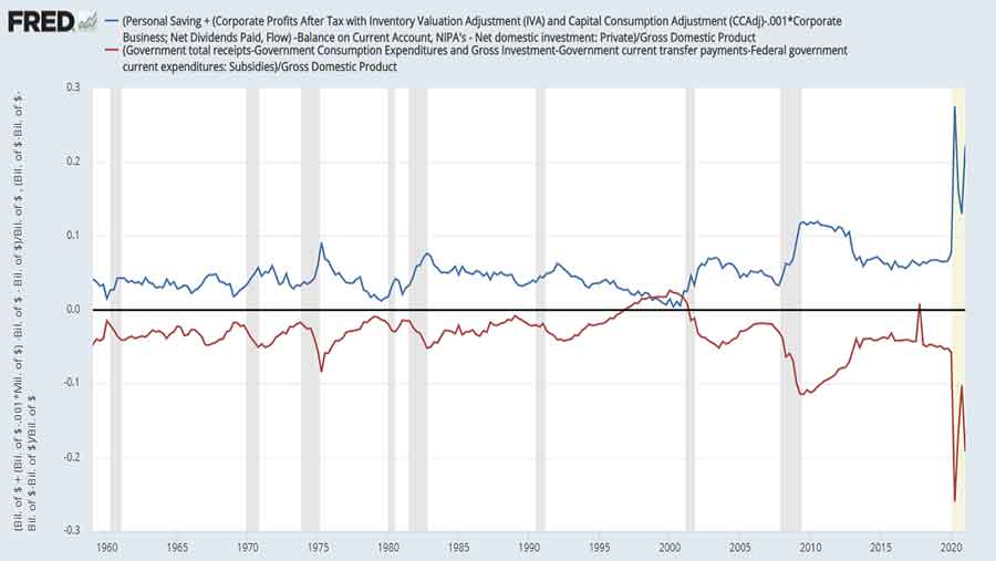
My impression is that after years of Fed-induced, yield-seeking speculation, investors have again concluded – at the worst possible time – that valuations simply don’t matter. I expect that they will suffer for it, not only in the form of steep losses over the completion of the market cycle, but also in the form of a long, interesting trip to nowhere for nearly 20 years. Recall that the total return of the S&P 500 lagged Treasury bills during the 18-year period from August 1929 to May 1947, during the 21-year period from November 1961 to October 1982, and during the 13-year period from March 2000 to April 2013. That’s 52 years in an 84-year time span. Passive investing is always embraced at market extremes, because that’s exactly the point when backward-looking returns are the most glorious. As Graham & Dodd wrote in Security Analysis (1934), looking back on the bubble that ended in 1929: “It was only necessary to buy ‘good’ stocks, regardless of price, and then to let nature take her upward course. The results of such a doctrine could not fail to be tragic.” See where this is going? As I’ve detailed in recent commentaries, my impression is that investors may also be underestimating the risk of substantial economic frictions and shortfalls in the coming quarters. Over the past year, the Federal government has run a deficit amounting to fully 19% of GDP. While our projections at the Hussman Foundation suggest a Delta-related bump to the pandemic trajectory into mid-September (see the public health note at the end of this comment), it’s very likely that private economic activity will continue to rebound. The problem is that this increase in private activity will replace, not augment, the impact of deficit spending. Recall that if the government runs a shortfall, where its revenue falls short of its spending (consumption and net investment), it must be true that other sectors, in aggregate – households, corporations, and foreign countries – will run an offsetting surplus. This is just an accounting identity, and it looks like this:
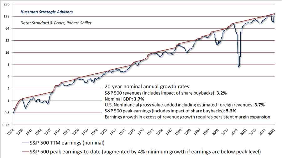
Over the past year, we’ve observed record government shortfalls. The mirror image of the deficit in the government sector has been record surpluses in other sectors: record personal savings, record corporate profits, and a record trade deficit (“surpluses” from the standpoint of foreign countries). Now ask yourself this question. What happens if the government doesn’t continue to run a deficit of 19% of GDP? See where this is going? By definition, it must be true that the surpluses of other sectors must shrink. We don’t know exactly how the declines will be distributed across sectors, but we know in aggregate that the sum of personal savings, corporate profits, and the trade deficit must decline. That’s not a theory. It’s an accounting identity. I’ve heard no discussion of this prospect, because my impression is that Wall Street simply does not think about equilibrium. In equilibrium, saving always equals investment. Again, that’s not a theory. It’s an identity, and nothing in banking, finance, or monetary policy alters that identity. If government “saving” increases as the result of smaller deficits, the only way to avoid an offsetting collapse in the “saving” of other sectors is for domestic investment to increase by the same amount. But gross domestic investment, in its entirety, is only about 17% of GDP, while net domestic investment (after depreciation) accounts for less than 5% of GDP. So even there, you’re unlikely to get enough to offset a massive reduction in pandemic-related deficit spending. There’s also no budget package being contemplated here that comes anywhere close to maintaining the deficit at 19% of GDP. Even the programs currently being discussed contemplate infrastructure and other spending over a multi-year period. So buckle up. As for current proposals, I’m certainly an advocate of productive infrastructure spending, education, and tax credits for investment and R&D, particularly in periods of economic weakness. Ultimately, the accumulated stock of productive investment, education, organizational structures, inventions, and unused resources is the entire basis of national wealth. We would be far better off as a nation if more of our policies were targeted toward productive investment instead of tinkering with financial markets in order to create bubbles, hypervaluation, and illusory “wealth.” For more on this and a broad range of other topics, see my June comment, Alice’s Adventures in Equilibrium. I’ve received very kind comments about that piece in particular, describing it with words like “epic,” “tour-de-force,” “magnum opus,” and “fully highlighted after the third reading.” If you missed it, well, get to gettin’ Pokey. All you need is a calculator To understand the relationship between valuations and expected market returns, there’s no need for “curve fitting” or “regressions,” or “data mining,” or any sort of statistical “model.” All you need is a calculator. Consider this. MarketCap/GVA reached an extreme of 2.4 at the March 2000 market peak. In the two decades since then, we’ve seen roughly 3.7% annual growth in U.S. nonfinancial gross value-added, including estimated foreign revenues with a similar growth rate for U.S. nominal GDP and S&P 500 revenues). At present, MarketCap/GVA stands at a record 3.5, and the S&P 500 dividend yield is just 1.4%. Assuming continued 3.7% annual growth in GVA, simply touching the March 2000 valuation extreme a decade from today would result in an average annual 10-year total return for the S&P 500 of: (1.037)(2.4/3.5)^(1/10)-1+.014 = 1.3% annually. Keep in mind that MarketCap/GVA been above its March 2000 peak only two times in history: the past 12 months, and the month preceding last year’s market collapse. What investors need now is a “permanently high plateau.” When you hear chatter on CNBC about “60% quarter-over-quarter earnings growth,” it’s useful to understand that this growth rate is largely an artifact of depressed year-ago earnings. The chart below presents the reality of the situation. The red line shows the highest level of trailing 12-month reported earnings to-date, incremented at a minimum 4% growth rate if earnings are below their peak. What’s notable here is that over the past 20 years, the growth rate of S&P 500 revenues (including the impact of stock buybacks), U.S. nominal GDP, and U.S. nonfinancial gross-value added have all averaged less than 4% annually. While earnings have grown somewhat faster, at 5.3% annually, the fact is continued earnings growth in excess of revenue growth would require profit margins to increase endlessly. Even in that event, the difference in growth would be too small to materially improve the dismal expected return that we estimate for the S&P 500 in the coming years.
In case one imagines that rapid inflation might at least boost nominal returns, remember that valuations are typically the first casualty of rising inflation. The positive effect of inflation on nominal growth typically dominates only after valuations have been crushed. As a result, U.S. stocks have lagged Treasury bills, on average, during periods of rising inflation. They’ve earned their reputation as “inflation hedges” during periods when the rate of inflation is declining.
Suppose we extend the investment horizon to 20 years, and simply assume that MarketCap/GVA at the end of that period stands at 1.7, no lower than the level we observed just last March. Given the same growth rate in fundamentals we’ve observed over the past 20 years, the resulting change in the S&P 500 would be: (1.037)(1.7/3.5)^(1/20)-1 = zero There’s that “long, interesting trip to nowhere.” One doesn’t need any extraordinary assumptions to recognize that, at current valuation extremes, the likely market return/risk tradeoff is dauntingly poor.
What alternative do investors have? As I’ve noted before, I don’t think it’s terribly useful to imagine that there are undiscovered “pockets of value” or passive investments that will solve the problem created by years of reckless speculation, unless it’s a passive investment in an active strategy. The alternative is patient, historically-informed, value-conscious discipline. As for active strategies, I published a white papertwo years ago detailing what I consider to be a reasonable and conservative alternative to a conventional passive asset allocation. I’ve been pleased with that approach in real-time. Geek’s Note: The calculations above are all very straightforward (though feel free to skip the next section if math gives you hives). If P is price, F is fundamental, V is the valuation ratio P/F, T is the holding period in years, and g is the growth rate of fundamentals, we have:
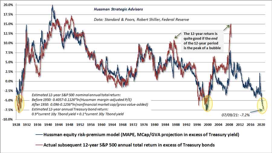
Then the annual capital gain can be written as: (P_future/P_today)^(1/T)-1 = (1+g) x (V_future/V_today)^(1/T)-1 That’s not a theory. It’s an identity. Now add the dividend yield, and you get the estimated total return. Force-fed speculation My impression is that when investors look back on the current speculative episode, or at least when historically informed investors do, the most egregious role will be assigned to the Federal Reserve. See, quantitative easing reliably does only one thing. It replaces interest-bearing Treasury securities with zero-interest base money (currency and bank reserves) that someone must hold, directly or indirectly, at every moment in time until that base money is retired. Provided investors are inclined to speculate, this mountain of zero-interest cash burns a painful psychological hole in their brains. They feel that they have to get rid of it, so they pass the hot potato to someone else, chasing riskier assets until those assets reach such extreme valuations that they, too, become priced for dismal future returns. What investors forget is that the effect of easy money relies on speculative psychology (which we infer from the uniformity of market internals). In contrast, once investors become risk-averse, they begin to consider the possibility of losses on risky assets, and safe-low interest liquidity can become a desirable asset rather than an inferior one. At that point, as we observed during the 2000-2002 and 2007-2009 collapses, easy money may do nothing to halt market losses. Meanwhile, when you hear people say that market valuations are “justified” by low interest rates, what they mean – whether they realize it or not – is that dismal future returns on bonds “justify” dismal future returns on stocks. The fallacy is in thinking that somehow the extreme valuations will not, in fact, be associated with dismal returns. That’s simply magical thinking, and it has nothing to do with asset pricing. Asset pricing tolerates no such delusions. The higher the price you pay for a given stream of future cash flows, the lower the long-term investment returns you will enjoy. Period. If I tell you that a $100 payment a decade from now costs $82 today, you immediately know that your expected return is 2% annually. You don’t need to know the level of interest rates to do that calculation, and low interest rates don’t somehow boost the expected return. The relationship between valuations and expected returns is just arithmetic. Knowing that interest rates are low simply adds insult to injury. Investors may imagine that at least stocks are likely to outperform the paltry 1.4% yield on 10-year Treasury bonds in the coming years. Our view is that they are mistaken. The chart below shows our estimate of the expected “risk premium” for the S&P 500, relative to Treasury bonds. At present, the estimate is as negative as it was in 1929 and 2000. Notably, this measure is better correlated with actual subsequent returns across history than any alternative we’ve studied, including the “Fed Model” (operating earnings yield vs Treasury yield) or the Shiller “excess CAPE yield.”
Clearly, the backward-looking market return is typically quite good (and better than one would have expected) if the end of the period is the peak of a bubble. It’s that feature of backward-looking returns that emboldens investors to ignore valuations at bubble peaks, imagining that old measures “no longer apply.” Amid the aggressively activist policies of the Federal Reserve, we had to adapt our own approach in late-2017, essentially abandoning our bearish response to historically-reliable “overvalued, overbought, overbullish” syndromes that had typically been associated with a limit to speculation. Since then, we’ve refrained from responding to those syndromes with a hard-bearish outlook except when our measures of market internals (our best gauge of speculative psychology) have also deteriorated.
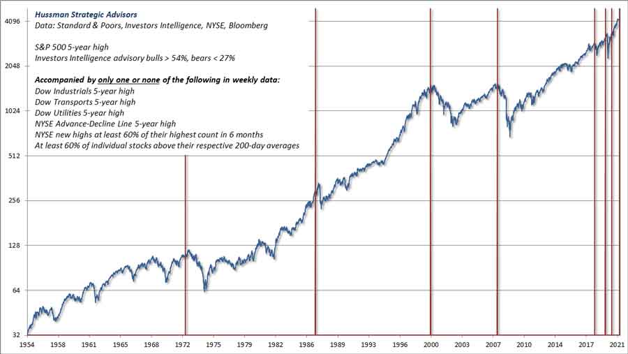
Our primary gauge of market internals is unfavorable here, but emerging divergences are also becoming evident in far more conventional gauges such as the Dow indices, leadership (new highs vs. new lows), breadth (advances vs. declines) and participation (the share of individual stocks joining a given market movement). The chart below shows one of numerous syndromes we track, illustrating the sort of divergence we’re observing here. The latest instance of this particular set of conditions was in late-June. Before assuming that the most recent instances have been non-events, notice that the chart is on log scale. The late-2018 instance was followed by a market loss of nearly 20%. The 2020 instance was followed by a market decline of about 35%, and even the instance in September 2020 was immediately followed by a correction of nearly 10%. That said, this chart is intended as an illustration of current divergences, not as a “prediction.” Our discipline is to align our investment outlook with observable conditions (primarily valuations and internals) at each point in time. No forecasts are necessary.
This is serious I consider Jeremy Grantham a friend I’ve never met, for reasons that include his thoughtful analysis, intellectual honesty, historically-informed perspective, unswaying discipline, and philanthropic work. Our views on value investing were aligned through several market cycles prior to recent years, both of us warning about the technology bubble, becoming constructive after it crashed, defensive again prior to the global financial collapse, and considering the market to be undervalued after the 2008 collapse. In late-2008, after the S&P 500 had collapsed by more than 40%, I shifted my market outlook, writing “U.S. stocks are now undervalued.” Grantham made a similar case in early 2009, titled Reinvesting when Terrified. Our primary departure in recent years was my fault. In 2009, amid economic conditions that were wholly outside of post-war experience, I insisted on stress-testing our methods against Depression-era data. Noting how much went wrong for investors during that earlier period, I was intent on ensuring that our methods were robust to those profoundly negative outcomes. In the interim, we missed the initial 2009 rebound with a neutral market stance. Later, our bearish response to extreme “overvalued, overbought, overbullish” syndromes created difficulty in the face of the Fed’s zero interest rate policies, which encouraged investors to speculate despite extremes and warning flags in market action that had reliably marked a “limit” to speculation in other market cycles across history. In late-2017, I threw up my hands and abandoned the idea that speculation still had any well-defined “limit.” The resulting adaptation left us content simply to gauge the presenceof speculation or risk-aversion based on our measures of market internals, without assuming a limit to either. Presently, Grantham and I find ourselves very much of the same opinion again. In recent months, he’s been very generous with his perspectives, and this interview with Patrick Poke is particularly worthwhile. Below, I’ve collected some of Grantham’s key observations: “Seriousness is flagged by the language that you use. I’ve always tried to make a big difference, but the difference is often wasted because people don’t remember what you sounded like when you were serious. The difference I’m trying to make is just the routine ‘the market is expensive,’ and the significant. The significant is three bubbles. This is serious. This is today a really impressive bubble in the U.S. equity market, where the best indicator of bubbliness is not value – they’re all, many markets, are very expensive – but is the very steep ascent laid in a long bull market. When it goes into warp drive and starts to rise at three or four times the normal rate. And the other thing is crazy behavior, very silly behavior. There is nothing like this in 1929 even. “This is one of those rare pieces of recommendation that are significant: This is a serious crisis of overpricing. It will drive a truck through a lot of portfolios. And more dangerously than normal, it is accompanied by a rapidly catching-up housing bubble that just reached the same multiple of income that it did in ’05 – the first housing bubble in American history. It is reflected around the world in all the Sydney’s and London’s of the world. It is accompanied by the biggest overpricing of bonds in the history of man, and the lowest yields. It is accompanied by a very low premium for risky bonds over high-quality bonds. And it is accompanied by a last minute, rapid rise in metals, foods, and even oil which has doubled quickly in a year. This is a dangerous combination that we have never done before. “A bubble phase can go on for a long time. By January, I said the signs were there that – check the boxes – if the bubble ended now, that would not look historically unusual; it would look pretty convincing. I must say I’ve had plenty of time to study, once again, the previous bubbles. They do have this characteristic that one thing after another starts to go bad and the market ignores it. “When I look at other bubbles, I see that there’s always a phase at the end where the risky stocks start to underperform the blue chips. This little feature is the real down and dirty detail of bubbles. A strange characteristic that has been involved in every bubble is that at the end, blue chips outperform on the upside, despite their low betas. And I think it reflects the famous quote about having to keep dancing. I think the attitude is, ‘I’ve got to play the game for business reasons and it doesn’t work, it doesn’t make sense, but I’m damned if I’m going to go over the cliff in Pumatech.’ At the moment it’s playing through, as if it means to ‘check the final box.’ The individual stocks are beginning to weaken irregularly.” Two quick notes [JPH]:
The destabilizing impact of activist Fed policy
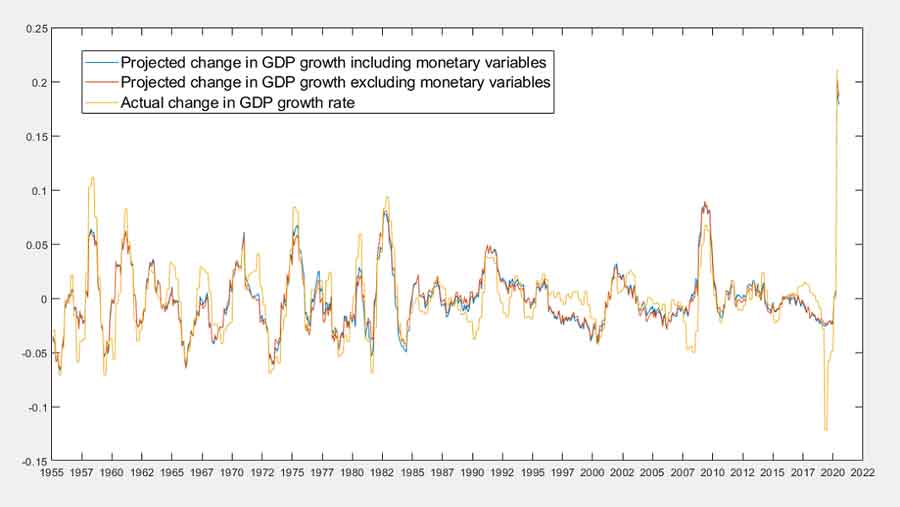
M’kay. Following the 2000-2002 collapse of the technology bubble, the Federal Reserve lowered short-term interest rates to just 1%. Predictably, yield-starved investors began to seek alternatives that might offer some “pickup” in yield. They found that alternative in mortgage-backed securities, which were universally considered to be safe because the U.S. had never experienced a collapse in housing prices. As Fed-induced yield-seeking speculation spurred investor demand for mortgage securities, Wall Street happily responded by creating more “product” to meet that demand. Of course, the only way to create a new mortgage security is to make a mortgage loan to someone. Ultimately, Wall Street found ways to use “financial engineering” to issue seemingly safe securities, while at the same time making mortgage loans to anyone with a pulse. Hence “no-doc” and “interest-only” mortgages. As I wrote at the time, “The real question is this: why is anybody willing to hold this low interest rate paper if the borrowers issuing it are so vulnerable to default risk? That’s the secret. The borrowers don’t actually issue it directly. Instead, much of the worst credit risk in the U.S. financial system is actually swapped into instruments that end up being partially backed by the U.S. government. These are held by investors precisely because they piggyback on the good faith and credit of Uncle Sam.” When the collapse came, it was the direct result of years of yield-seeking speculation provoked by the Federal Reserve. Congress responded to the immediate “catalysts,” accompanied by the self-serving testimony of financial institutions seeking bailouts for their “troubled assets.” No intervention was enough until, in the second week of March 2009, the Financial Accounting Standards Board changed rule FAS 157, and allowed banks “discretion” in how their distressed assets could be valued. With the stroke of a pen, widespread bank insolvencies vanished, by making those insolvencies opaque. A decade of zero interest rate policy then restored bank capital by depriving depositors of income. Meanwhile, the Federal Reserve, which was the very root of the whole episode of yield-seeking speculation, scooched away not only blameless but seemingly heroic. Undoubtedly, the Fed’s purchase of government backed mortgage securities provided important liquidity to the housing market during that period. Yet there’s no compelling evidence that the trajectory of the economy in response to activist Federal Reserve interventions has been any different than one could have projected using non-monetary variables. Now, hold on. How could one possibly demonstrate that? Well, suppose you’ve got two variables, X1 and X2, and you’re trying to explain movements in Y. If both variables have independent effects on Y, then forecasts based on both X1 and X2 should be more accurate than forecasts based on X1 alone. If we want to explain changes in real GDP, for example, we could use only “non-monetary variables” – current and past information about output, employment, and inflation – or we could expand our information set to include “monetary variables” like the Federal Funds rate and the size of the Federal Reserve balance sheet (relative to nominal GDP). If extraordinary monetary policy matters, information about monetary variables should improve our ability to explain subsequent movements in real GDP. If it doesn’t, the forecasts will be largely the same with or without the monetary information. The chart below should be rather disturbing to Fed policy makers. The fact is that neither information about the Federal Funds rate nor the ratio of base money to GDP materially improves the ability to project subsequent changes in real GDP growth. Knowing the stance of Fed policy, however extreme it might be, contributes virtually nothing.
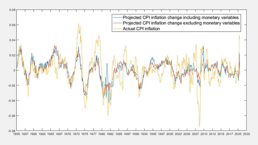
The same is true for changes in CPI inflation. Monetary variables add nothing beyond what non-monetary variables already explain.
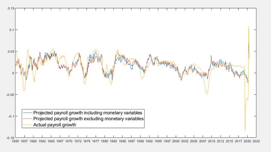
The same is true for growth in non-farm payrolls.
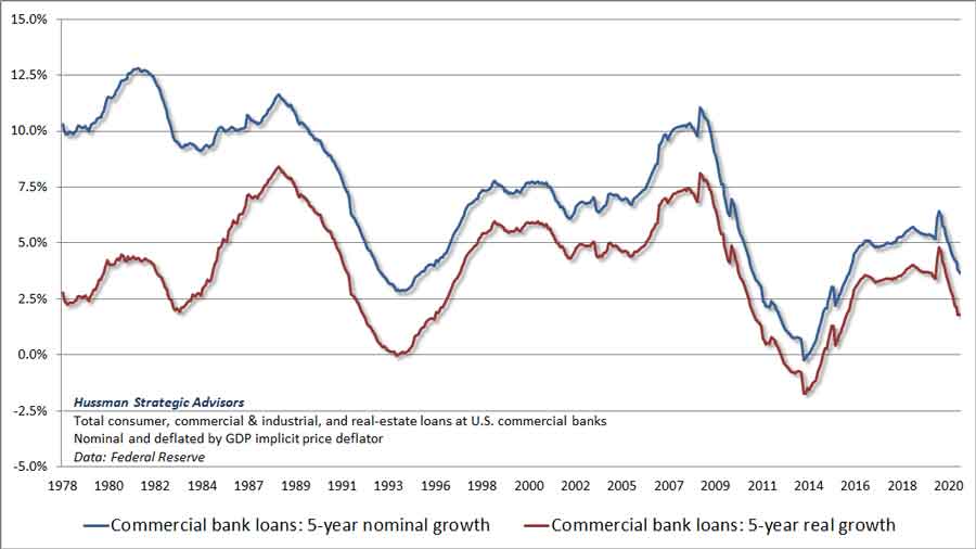
Given that the Federal Reserve has purchased trillions of dollars of government securities and replaced them with trillions of dollars of bank reserves, one might imagine that surely at least bank lending growth must have been robust in recent years. There too, one would be incorrect.
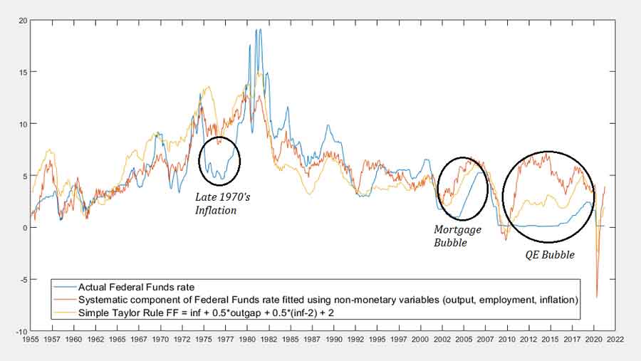
We can think of monetary policy as the sum two components: a “rules-based” component that’s systematically related to non-monetary variables like output, employment, and inflation, plus an “activist” or “extraordinary” component that’s more discretionary. Economist John Taylor (one of my mentors and dissertation committee members when I was at Stanford) has often encouraged the Federal Reserve to adopt a more rules-based approach. John is known for the “Taylor Rule,” which prescribes a Federal Funds rate based on the GDP output gap and the prevailing level of inflation. Suppose that non-monetary variables help us to explain subsequent movements in real GDP, but that adding monetary variables doesn’t significantly improve those projections. Well, this tells us that the activist component of monetary policy is essentially “noise” as far as GDP growth is concerned – it contains no useful information. This is exactly what we find in the data. Activist Fed policy is demonstrably ineffective.We can’t necessarily say the same thing about the systematic component of monetary policy. It’s possible that systematic monetary policy is actually important, but that its impact is fully captured by the non-monetary variables that drive that systematic component. The chart below shows the actual Fed Funds rate, along with a simple variant of the Taylor Rule, and an estimate of the “systematic” component of the Fed Funds rate (calculated as the fitted value of the Fed Funds rate based on non-monetary variables alone). While including a larger set of variables and lagged data can modestly change this estimate, the chart captures the essential distinction between “activist” and “systematic” policy. Several “activist” departures of Fed policy are notable. The first is in the mid-to-late 1970’s, when the Fed evidently kept interest rates lower than appropriate, at least until Paul Volcker was appointed. Another clear departure was between 2002 and 2007, which we now associate, in hindsight, with the mortgage bubble that preceded the global financial crisis. The most recent departure has been most egregious. There’s certainly a case to be made that the Fed had a “systematic” reason to pursue zero interest rates briefly in 2009 and early-2010, and again briefly during 2020, but those brief instances are evidently the only periods in which zero interest rates can be justified as a systematic policy response.
Never confuse “statistical significance” (confidence that the relationship between two variables is not precisely zero) with “meaningful effect.” One can certainly torture the data enough to conclude that activist Fed policy has a “statistically significant” effect based on a p-value or F-test. Yet as we’ve seen, the practical size of that effect on output growth, employment growth, or inflation changes is essentially zero. Instead, the main impact of activist policy is to encourage yield-seeking speculation, asset bubbles, and the financial distress that accompanies the inevitable collapse of these bubbles. In my view, the Federal Reserve has been engaged in profoundly reckless behavior in recent years. Its primary impact has been to endanger the stability of the economy and the financial system.
The root causes of a crash are always the factors that nurtured and encouraged the ‘happy’ period of carefree and irresponsible speculation that led to the bubble extreme. When history looks back on the current bubble, amid the ruins of every previous bubble in history, it will find the ineffective, misguided, and dogmatic activism of the Federal Reserve at the very center of it all.
|
Send this article to a friend:
 |
 |
 |

![[Most Recent Quotes from www.kitco.com]](http://www.kitconet.com/images/live/s_gold.gif)
![[Most Recent USD from www.kitco.com]](http://www.weblinks247.com/indexes/idx24_usd_en_2.gif)
![[Most Recent Quotes from www.kitco.com]](http://www.kitconet.com/images/live/s_silv.gif)