
Send this article to a friend:
April
29
2021

|
Send this article to a friend: April |
|
The Stock Market’s Collapse is Near
Because stock market performance is an important factor in U.S. Treasury behavior, I study it closely. I wrote a paper in 2012 that, among other things, examined the consistency (or actually inconsistency) of long-term S&P 500 performance. Between our founder Robert Kessler’s indelible memory of slogging his way through the futile stock market of the 1960s and 1970s and my study of the long-term history of the S&P 500, you will see below that the powerful up-trend of the last 12 years is not a comprehensive representation of the stock market. There is a bad side too; one whose magnitude and duration may surprise you. The alternating pattern of extended good and bad stock market periods, an all-time high valuation, and questionable-quality asset appreciation say we are near to the end of this good stock market period. There will be a large drawdown and an extended low/negative return period to balance out the above average return of the last 12 years. About the data and study The chart and table that follow show the cumulative real total return (dividends reinvested) and various statistics from the S&P 500 back to 1910 split into eight periods: four good (2, 4, 6, and 8) and four bad (1, 3, 5, and 7). The S&P 500 index formally began in 1957 but has been back-analyzed (not by Kessler) to provide comparable information to the early 1900s. The chart is shown on a logarithmic vertical axis to normalize it for exponential growth, i.e., each axis label is double that below it. I chose period demarcations subjectively, but at points to best isolate good periods from bad. I use the real (return after taking out inflation) rather than the nominal return because it better captures the difficulty of the stock market in the 1960s and 1970s. For instance, because annual inflation averaged 7% in period 5 in the first chart below, stocks made a significant positive return on a nominal basis (+5.2% annualized), but was negative (-1.7% annualized) after inflation. The net of inflation figure (real) is more relevant to the experience than the nominal return. Analysis follows the chart and table. Print this pdf of the first two charts to consult as you read the text.
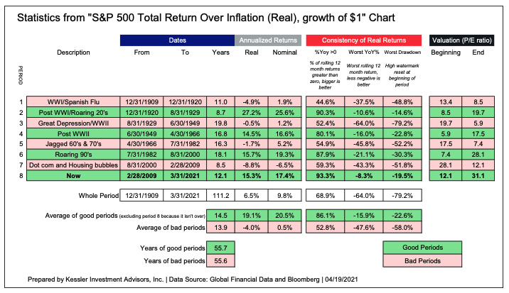
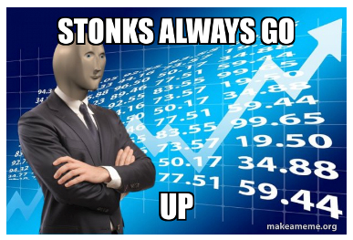
There are several things to point out. Alternating good to bad Looking at the line chart as a whole, the S&P 500 has gone through long periods of good returns (green boxes) alternating with just as long periods of bad returns (red boxes). For the 111+ years, the time spent in good periods is nearly the same length as time spent in bad periods; 55+ years. It isn’t hard to imagine that at 8.5 years minimum historically, the good and bad periods lasted long enough to condition investors to expect the same indefinitely. Returns in the good periods look almost like diagonal lines with little volatility. Returns in the bad periods look jagged with multiple major drawdowns (losses). They make little, if any return. At the end of good periods, it seems nearly everyone is invested in stocks. At the end of the bad periods, investors say they will never buy a stock again. They are two different experiences – in the midst of one, you wouldn’t know the other type existed before experiencing it. The bad periods The long timeframe of this chart belies just how hard the bad periods were. Period 3, the Great Depression and WWII, lasted 19.8 years with no real return (-0.5% annualized) and a paltry nominal return of 1.2% annualized. In those 20 years, there were three serious drawdowns; -79%, -50%, and -49%. Period 5, the 1960s and 1970s, lasted 16.3 years and lost 1.7% annualized real return. There were four major drawdowns; -18%, -36%, -52%, and -27%. Period 7, the dot-com and housing bubbles, was shorter at 8.5 years but lost 8.8% annualized real and had two major drawdowns: -47% and –52%. Despite these drawdowns eventually being recovered, they were severe enough to tempt selling at the wrong time and not experiencing the recovery. The good periods The good periods are just as good as the bad periods are bad. They rise up consistently with few reminders of risk. The more consistent the movement, the more it attracts new investment and leverage that propels the price even higher – a positive feedback loop. This is the environment we are in now. The red “Consistency of Real Returns” data in the table above shows that the three measures of consistency I’ve chosen are quite different in good periods than bad. The good periods have had between 80%-90% positive rolling 12-month periods, where in bad periods, it is 40%-60%. The good periods’ “Worst YoY%” is between -8% and -20%, where it ranges from -38% to -64% in bad periods. The worst drawdown in good periods ranges from -15% to -30%, where in bad periods it is -50% to -80%. The last 12 years (period 8) have been the most consistent period in two of the three metrics and just a tad worse than the roaring 1920s in maximum drawdown. The unprecedented consistency of this bull market has created the appearance of a sure thing – exemplified by the Reddit mantra of “stonks always go up.” Risk has never been so forgotten.
Low P/Eratios (less than 15) indicate attractive pricing where high P/E ratios (say more than 25) indicate expensive pricing. If you look under the black heading of “Valuation (P/E Ratio)” in the table above, you will see that the price earnings ratio falls from high to low in the bad periods and rises from low to high in the good periods. Multiples (P/E ratios) expand (prices rising faster than earnings) in good periods as investors invest for momentum and not for fundamentals. Multiples compress in bad periods (prices fall more than earnings) as the past good period is attenuated and fundamentals (low P/E ratios or high dividends) are needed to attract equity investment. In the most recent period 8, the P/E ratio has risen to an all-time high level; over 32x in recent days. Stocks have never been more expensive.
Mean reversion At a broad level, the good periods appreciate faster than the long-term average and the bad periods balance that, returning less than the long-term average. In other words, the stock market overshoots on the upside in good periods and then in bad ones, overshoots several times on the downside; the combination make the long-term average. There is no official long-term average to revert to; it is a moving target. But a fair way to estimate it is to find a growth trend where the index spends just as much time below the average as above it. For this period, that number is 5.75% annualized (shown as a dotted line in the first chart). In order for the S&P 500 to return to that level, it needs to fall by 45%. Markets overshoot and so it is logical to think an initial drawdown will exceed that. GDP limitation It is thought that aggregate stock market returns (the S&P 500 is a proxy for the aggregate) over a long period shouldn’t exceed the growth of its country – its GDP. This is because the stock market is the economy and there is no clear reason why its composite returns should sustainably exceed GDP growth without an equivalent-sized group under-performing. And yet, stock returns have outpaced GDP over the long term – by a lot. Real U.S. GDP growth, since the inception of official records (Q1 1947, 74 years ago), has grown at a 3.1% annualized pace. Over the same period, the S&P 500 has a real return of 7.7% annualized (nominal of 11.4%) and has thus outperformed real GDP by 2.5x; a precarious outperformance that shouldn’t be expected to continue. Dividend limitation Another factor stacked against stock investors are the lack of meaningful dividends. Stock issuers pay dividends as a way of compensating shareholders with a portion of their earnings. Over the 111+ year history studied, dividends are responsible for about two-thirds of the real return. Dividends were 4.3% annualized of the 6.5% annualized real return. But dividends are much lower now. The dividend yield of the S&P 500 is just 1.4% per year (4/19/2021). In other words 2.9% (4.3% - 1.4% = 2.9%) of annual past performance is no longer there for the future. Similarity to the Spanish flu and the Roaring Twenties Stock market bulls are using the narrative that the 2020s will be like the Roaring 1920s because of the COVID-19 pandemic’s similarity to the 1918-1919 Spanish flu; it is 100 years later and a great decade of stock market performance followed. The S&P 500 had an amazing 27.2% annualized real return in the 1920’s (period 2). There are immediate reasons why the stock market of the 2020s will not be like the 1920s.The 1910s (period 1) was a terrible decade for the stock market (-4.9% annualized real return), and so the 1920s had a low base to build from. In contrast, the 2010s (period 8) was a high-performing decade, returning 15.3% annualized real. This can also be seen with P/E ratios. The P/E ratio at the start of the 1920s was 9.6x where the P/E ratio of the S&P 500 now is over 32x; more than 3 times more expensive. In other words, the bull market already happened. Finally, the 1920s followed World War I. Economic booms follow major wars. It goes without saying, but there was no equivalent war in the 2010s. Signposts of the end In addition to 12 years of a consistent, strong bull market and the price/earnings ratio at an all-time high, there are other familiar signposts of the end. Towards the end of a stock bull market, questionable assets appreciate with abandon. There are many examples now:
But this time is different? Stock market bulls suggest the stock market will continue rising because the pandemic will soon be over (I’m not so sure) and developed economy governments have put enough money into their economies to keep their stock markets elevated (not sure about that either). Investors have been lulled into complacency because the stock market has rallied through every risk thrown its way for more than a decade. It is a mistake to think this is normal or sustainable. Some feature of COVID-19 will likely be the stock market’s undoing, but it doesn’t have to be. Possible candidates include an emerging market sovereign fiscal crisis, a large hedge-fund/bank blow-up, fraud, social unrest, or a geopolitical crisis. There is also the possibility that an inflection point won’t have an identifiable catalyst, but could happen just from a collective realization that asset prices reflect optimism extrapolated further into the future than is realistic. I don’t know when or how, but sentiment will change; the boom and bust process is as old as civilization. When it happens, nobody is big enough to stop it coming down. Fiscal and monetary stimulus is this cycle’s “false idol.” Every cycle has one – a reason why it can’t come down. Right before the stock market crash of 1929, Yale economist Irving Fisher said stock prices were in “what looks like a permanently high plateau.” Portfolio insurance was the culprit in 1987. In 2000, it was said that the internet was a “new paradigm” obviating historical comparisons. Before the 2007-2008 stock market crash, Alan Greenspan, chairman of the Federal Reserve, said the housing market was too varied geographicallyto come down at once. Ben Bernanke, the subsequent chairman of the Federal Reserve, infamously said that he thought losses to subprime mortgage loans were “contained.” All of them were wrong. As Jeremy Grantham, co-founder of Boston investment firm GMO, said in his important 01/04/2021 article “Waiting for the Last Dance,” Nothing in investing perfectly repeats. Certainly not investment bubbles. Each form of irrational exuberance is different; we are just looking for what you might call spiritual similarities. Even now, I know that this market can soar upwards for a few more weeks or even months – it feels like we could be anywhere between July 1999 and February 2000. Which is to say it is entitled to break any day, having checked all the boxes, but could keep roaring upwards for a few months longer. My best guess as to the longest this bubble might survive is the late spring or early summer, coinciding with the broad rollout of the COVID vaccine. At that moment, the most pressing issue facing the world economy will have been solved. Market participants will breathe a sigh of relief, look around, and immediately realize that the economy is still in poor shape, stimulus will shortly be cut back with the end of the COVID crisis, and valuations are absurd. ‘Buy the rumor, sell the news.’ But remember that timing the bursting of bubbles has a long history of disappointment. Many will wait to see the stock market come down before they believe it, but keep in mind the adage that “a bull market will do everything to keep you out, a bear market will do everything to keep you in.” As it comes down, cheaper prices will entice bulls who then end up losing more than they otherwise would as it falls more. They mistakenly use the prior period’s consistency to trade the new bear market which, pun intended, is a completely different animal. My firm expresses this opinion by owning the long-end of the Treasury yield curve – 10-year and 30-year bonds. In Treasury bonds, you get paid to wait. If you were short stocks instead, you have to pay the dividend to wait. When “risk-on” product becomes risky again, there are only a few reliable appreciating assets; the U.S. Treasury market being the best. 10-year U.S. Treasury yields fell 367 and 324 basis points respectively surrounding the last two major stock market drawdowns in 2000 and 2008. The 10-year U.S. Treasury has a yield of 1.58% now (4/19/2021). It falling the average 346 basis points would take it to -1.87%. I am not suggesting it gets that deeply negative, but there is certainly plenty of room for Treasury bonds to appreciate (prices rise as yields fall).

Eric Hickman (@EricWHickman) is president of Kessler Investment Advisors, Inc., an advisory firm located in Denver, Colorado specializing in U.S. Treasury bonds.
|
Send this article to a friend:
 |
 |
 |
 Advisor Perspectives welcomes guest contributions. The views presented here do not necessarily represent those of Advisor Perspectives.
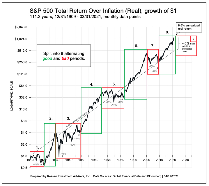
 Valuation
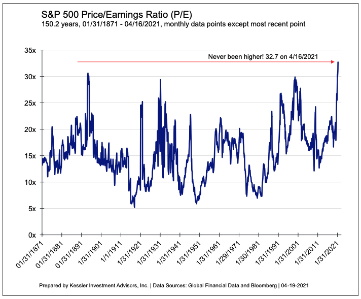
![[Most Recent Quotes from www.kitco.com]](http://www.kitconet.com/images/live/s_gold.gif)
![[Most Recent USD from www.kitco.com]](http://www.weblinks247.com/indexes/idx24_usd_en_2.gif)
![[Most Recent Quotes from www.kitco.com]](http://www.kitconet.com/images/live/s_silv.gif)