
Send this article to a friend:
October
03
2019

|
Send this article to a friend: October |
|
America’s Perilous Path Of Wealth Distribution
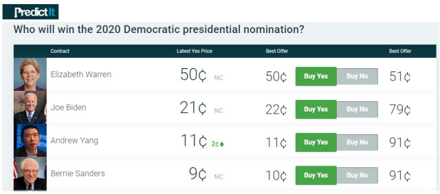
Wealth Tax Talk We hear a lot these days about wealth taxes. A new wealth tax on the upper echelons of the top 1% of wealthiest households will likely be at the center of the 2020 presidential campaign. This kind of rhetoric and these ideas just don’t happen in a vacuum and are gaining political momentum. Our analysis will illustrate how it is based and moored in the two-decade-long change in the country’s distribution of wealth. The prediction markets now give Elizabeth Warren a 50 percent probability of winning the Democratic nomination compared to only 21 percent for Joe Biden.
Here is a little snippet of Elizabeth Warren’s plan for a wealth tax from her campaign website.
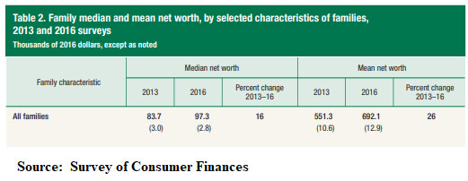
During the next week, we will present a series of posts analyzing wealth distribution in the United States, which seems to have reached a political tipping point. The top 1% of American households now have more wealth than the bottom 90% compared to 79 percent of the bottom 90% in Q1 2000. In this post, we briefly present some data and charts on the growing wealth inequality between the top 1% and the bottom 50% of U.S. households. Changes In Wealth For Average Household Just a few caveats before looking at the following charts. First, see our post, Be Skeptics Of Macro Data In The Two-Speed Economy, warning about looking at averages when data distributions are so skewed. This is illustrated in the bible of wealth distribution, the Fed’s Survey of Consumer Finances (SCF),
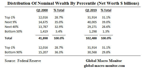
Note the significant differences between the average and median data points, which is the result of the top-heavy distribution of wealth in the U.S. where 70 percent of household wealth is now held by the top 10%, pulling up and distorting the average. Second, our estimate of the number of households, which we have sourced from the Census Bureau and extrapolated for the current year. There is an ongoing debate about what constitutes a household and a family. Nevertheless, we are very confident our estimates in the following two charts are very good and close approximations of the data that will be eventually published in the next SCF, which should be out in a year or two. The Raw Data The following table illustrates the aggregate wealth data from the Fed’s new Distributional Financial Accounts (DFA). Note we use the terms “wealth” and “net worth” interchangeably.
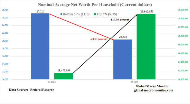
Though the DFA time series begins in 1989, we use Q1 2000 as our base year not only because it represents the beginning of the new Millenium but it was also the quarter of peak aggregate nominal wealth for the bottom 50% of households. Key Takeaway The most stunning takeaway, at least for us, from the table is that the nominal aggregate wealth of the bottom 50% has declined, underscore fallen in nominal terms, over the past 19 years. That is almost a 10 percent decline while, at the same time, the wealth of the top 1% has increased by 166 percent. The share of the total household wealth of the bottom 50% has dropped from a mere 3.4 percent in 2000 to 1.3 percent in Q1 2019. The aggregate wealth of the top 1% relative to the bottom 50% has increased from a factor of 8.5 to 24.6 from Q1 2000 to Q1 2019. Stunning and politically dangerous. The data are even starker when taking into account that household formation has grown by over 20 percent since the beginning of 2000. Nominal Average Wealth/Net Worth Per Household
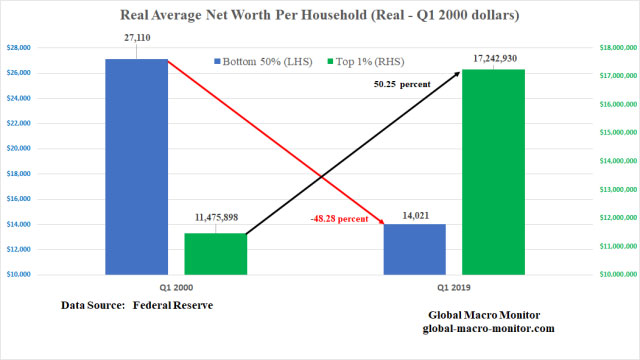
Real Average Wealth/Net Worth Per Household
Go no further to understand America’s rising populism and growing political conflict than the above two charts. It also illustrates the country’s two-speed economy and the sharp contrast of the economic well being of the top percentile groups and the bottom 50% of U.S. households. Real-World Example Of Wealth Decimation It is hard to comprehend the decimation in purchasing power of the wealth of the average household on the other side of middle from 2000 to 2019 but let us help with a simple real-life example.
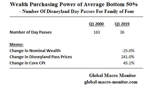
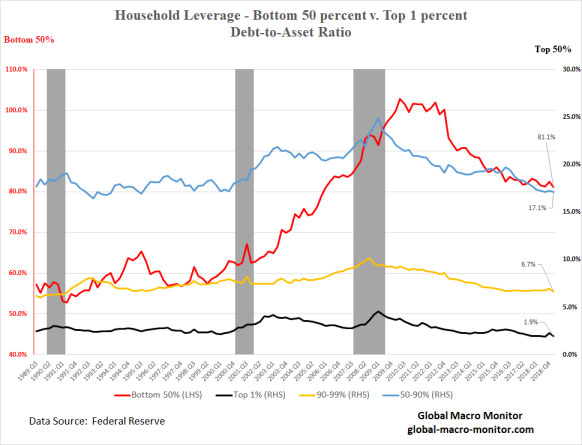
In 2000, the average wealth per household of the bottom 50%, assuming a family of four, could purchase 163 day passes at Disneyland. In 2019, however, given the decline in nominal wealth and the increase in Disneyland ticket prices, which have outpaced core CPI by more than 5x, fell to just 36 days. Official Inflation Data Flawed Just an aside, the relative increase in Disney tickets illustrates why we are so skeptical of and think the official inflation data calculated by the government underestimates real-world price increases, which are what truly matter with respect to a consumer’s real purchasing power. Yes, we do understand relative price changes and that Samsung large screen televisions are much less expensive than they were in 2000. Another Data Caveat One should not make the mistake of viewing the above comparisons as a panel study. That is there is no doubt that some households were in the bottom 50% in 2000 are now in the top 1%, and vice versa. In addition, the data are averaged with a range from a deeply negative net worth for the lowest percentiles of the bottom 50% to around $100k of the top percentile of the bottom 50%. Ditto for the top 1% where a few of the highest percentile households hold over $100 billion in wealth and the lowest of the top 1%, i.e., the 99th percentile of all U.S. households, is just over $10 million. Keep that in perspective, folks, during your meditation on the data. Why The Wealth Divergence? One, or the major factor of the wealth divergence is that the returns earned on assets such as stocks, bonds, and equity in private businesses have greatly exceeded the growth of wages, which have been nothing short been dismal over the past 20 years. The several rounds of quantitative easing (QE) and the subsequent asset inflation have greatly contributed to the problem, increasing the support for some kind of a People’s QE. We also illustrated in an earlier post how debt-laden the bottom 50% is relative to other percentile groups.
Upshot So, there you have it, folks. It doesn’t take a Ph.D. economist or political scientist to understand what, we believe, is the biggest problem in today’s political economy. Just contemplate and study the few charts and data points above. It will certainly be one of the main drivers of the 2020 presidential election and the winner will most likely be the candidate who convinces the majority of the electoral college or voters in the swing states, that he/she can best fix the problem or, more darker, is better at exploiting the rage against it. Yikes! Either way, we suspect the 2020 campaign will be very ugly. The concept of fairness in the distribution of resources is not just political but the literature increasingly shows is more innate. The perception of fairness also triggers more cooperation and helps an economy and society become more efficient and run more smoothly. See our June post, The Innate Angst Of Inequality, or take a few minutes to view the video in the Appendix at the bottom of this post. Can Markets Handle A Hard-Left Turn? We are not so sure asset markets can handle and sustain a hard-left political turn. We are fairly certain, however, the current trajectory of the distribution of household wealth is not politically sustainable. We are hoping for new policies that focus more on equitable growth, pulling the lower middle and bottom 50% of households up to close the wealth gap rather a radical redistribution of wealth program. The quickest but ugliest path to close the wealth gap is for both public and private equity markets to take, say, a 50 percent hit, which will end up hurting the most vulnerable. I recall a conversation with one of my lefty political science professors during the dot.com crash. I asked if he was happy that the wealth gap between the richest man in the world at the time, Bill Gates, and the poorest person (maybe it was me) was cut in half with the crash of the Nasdaq. He responded, “no, let’s not do it that way.” Good for him. Wealth Tax As An Investment In Social Stability Nevertheless, some sort of redistribution of wealth from the uber-wealthy is inevitable, in our opinion. After all, the top of the top 1% have taken down an extraordinarily disproportionate share of the increase in total household wealth since 2000. They should view some sort of a wealth tax as an investment in the country’s social infrastructure and political stability in order to protect the totality of their asset holdings. Whatever the scenario, the markets are vulnerable and to extract ourselves from this mess it is going to take some very effective and competent leadership with lots of nuance and finesse. Apollo 13 like leadership and finesse.
Stay tuned for more data posts. Long pitchforks and water cannons, for now. Running Out Of Free LunchesWe are almost out of free lunches, folks, and will be posting only sporadically unless your support increases. Donate whatever you think is fair by clicking on the Donate button below. You do not need a PayPal account and can use almost any credit card. Don’t be a free rider. Thanks, so much.
|
Send this article to a friend:
 |
 |
 |


![[Most Recent Quotes from www.kitco.com]](http://www.kitconet.com/charts/metals/gold/t24_au_en_usoz_2.gif)
![[Most Recent USD from www.kitco.com]](http://www.weblinks247.com/indexes/idx24_usd_en_2.gif)
![[Most Recent Quotes from www.kitco.com]](../09.19/images/t24_ag_en_usoz_2.jpg)