September
21
2013
21
2013
|
September 21 2013 |
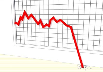
Terrible Technicals
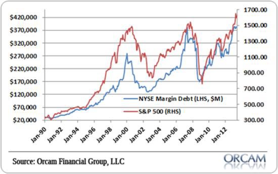
I have a theory about technical indicators, which is that most people only pay attention to the ones that that confirm what they already think. Technicals are primarily entertainment, in other words. But every once in a while a market's charts, graphs, and images line up in a persuasive way, and for U.S. stocks this looks like one of those times. A few examples: Margin debt This is a measure of how much money investors have borrowed against their stocks to buy new stocks. The more exciting their recent gains, the more willing they are to borrow. By definition, they're most excited when stocks have been going up for a long time (otherwise stocks would have stopped going up), so high margin debt tends to precede big corrections. Today, margin debt is just shy of 2007's all-time record.
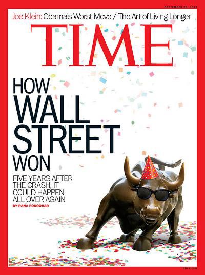
Magazine cover hyperbole The big consumer magazines are known for being inappropriately excited or depressed at major market turns. Businessweek's "Death of Equities" cover – just before the beginning of the 1982-2000 super-bull market – is the most notorious. Time came in a close second with its "Home Sweet Home" cover just before the housing bubble burst, and is now back with a cover titled "How Wall Street Won" – though its subtitle, "Five years after the crash, it could happen all over again," implies that the editors may be hedging their bets. This isn’t a perfect example of magazine hubris, but is close enough for our purposes.
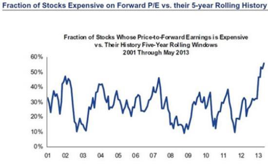
Excessive P/E ratios Another measure of investor (over)confidence is the amount they're willing to pay for a given dollar of public company earnings. When pessimistic they're not willing to pay much at all, but when convinced by a few years' of nice gains that they're geniuses, they're willing to pay a lot. Currently, according to Gordon T. Long of Macro Analytics, they're willing to pay even more than in 2007, just before the world almost fell apart.
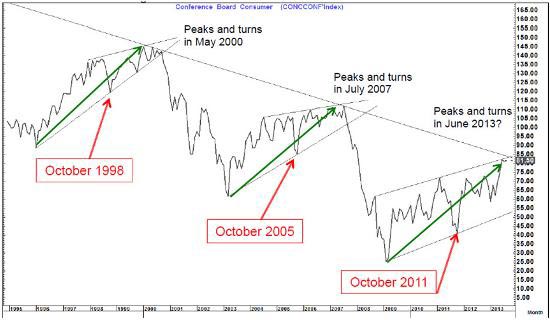
Various organizations like to survey US citizens about how they're feeling and what they intend to buy in the year ahead. They then cook the responses down to a "consumer confidence" number that analysts use to predict retail sales and GDP growth. As you can see from the following chart (also from Macro Analytics' Gordon T. Long), consumers have been repeatedly coaxed out of depression by successively larger rounds of money printing, only to collapse back into despondency when the resulting bubble bursts. Each peak has been lower, implying that stimulus is losing its potency. If the pattern holds, the top is in and another collapse is imminent.
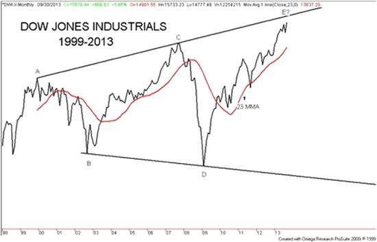
Broadening triangle This one is from David Chapman, manager of the Millennium Bullion Fund. As he describes it in a recent SafeHaven article:
|
|---|
Send this article to a friend:
 |
 |
 |