
Send this article to a friend:
May
03
2018

|
Send this article to a friend: May |
|
One Of Two Things Is About To Happen Now That We’ve Reached ‘Debt Saturation’
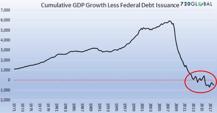
I have tried to explain this concept many times before but never had a chart to do it with. Please note the start date of the chart is 1971, this is not by any coincidence as that was the year the U.S. dollar became fully fiat and backed by nothing but “faith”. Before getting started, it is important to understand what August 15, 1971 really meant and why Nixon took us off the gold standard. The obvious is because with France and other nations demanding conversion of dollars into our gold, it would have only been a few short years before our stockpile was completely depleted. The other, less obvious (so far) reason to come off the gold standard was because it allowed the U.S. to operate without the “restrictions” on monetary (and fiscal) policy that a gold standard imposes. In other words, once gold’s restrictions were lifted, literally unlimited amounts of dollars could be printed by the Fed along with unlimited amounts of fiscal borrowings by the Treasury …to a point. The chart above actually shows you exactly where that point in time was, please let me explain “why”.
Looking at the chart you will notice from 1971 to 2008, the line was for the most part an upward trajectory. Beginning 2008, you will also notice the line has basically crashed below all years prior to 2008 and is now “negative”. For perspective we need to know what “the line” actually represents. Basically it shows net growth of GDP for any given year with the amount of Treasury issued debt subtracted from GDP. For instance, if GDP were to grow by $500 billion over the previous year and the Treasury borrowed a net $250 billion then that year would register a positive $250 billion. Conversely, if GDP grew by $500 billion but the Treasury issued a net $1 trillion, the number registered would be negative $500 billion. Also note this chart is “cumulative” which means the current year is added or subtracted from all the previous years combined. So GDP growth net of Treasury debt issued was positive until 2008 and has collapsed since then. Why and what does it mean? First, because the line is cumulative it only makes mathematical sense that it is now below “zero” because we have accumulated more debt than we produce in total GDP, $21 trillion versus $19 trillion. (I would remind readers that back in the day, 1970’s-80’s, a number greater than 100% debt to GDP ratio would qualify you for Banana Republic status!) Another way to view the chart is to see it as a map of whether issuing new debt adds to GDP or whether it is a drag. Clearly prior to 2008, the issuance of new debt generally added to GDP, since then, new debt has been an hindrance. This only confirms in chart form what we already knew, each dollar of new debt is creating well less than a dollar of new GDP. So what happened in 2008 for the relationship to change from new debt helping …since it always had in the past, to new debt not helping so much or even hurting? SIMPLE! As I wrote in 2007-2008, and maybe a dozen or so times since, we reached DEBT SATURATION! We first saw this in the real estate markets as rental income from properties no longer covered debt service. This sector could not take on more debt because borrowers/buyers either did not want to nor could afford to take on more debt. As I have said before, at that point (2009), treasuries and central banks were the only entities left that had room on their balance sheets to lever up further …which they have in spades! At the time we called them the “white knights” who rode in with their balance sheets and saved the system by reflating. But levering up came at a high cost. Yes it did buy another 10 years or so time but now the bulk of sovereign treasuries and central banks have reached their respective credit limits! In essence, the world has now as a whole reached credit saturation levels …otherwise known as banana republicland! As we have said for the last several years, in no mathematical way can the current build up in debt and future promises ever be repaid in current currency terms. Only one of two things can happen, either the debt does not get repaid in which we will see massive and total default, or, the currencies must be devalued to levels where the debt can be repaid. Option number three and the one we have been told all these years is now discredited …remember how we have been constantly told we would “grow our way out from under the debt”? This chart is your proof positive that it ain’t so!!! Switching gears to finish, we have another chart to look at.
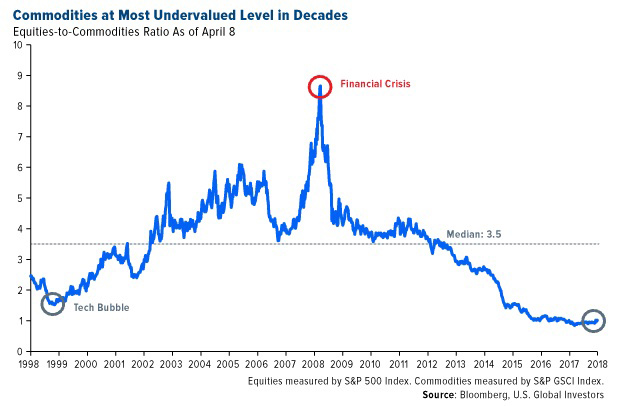
This is a chart of commodities priced in terms of the S+P 500. More or less “stocks versus commodities. It would look fairly similar if it was shown as commodities priced in 10 yr. US Treasuries. Basically this can be viewed as real stuff priced in “confidence”. In other words, commodities will be cheap in terms of paper assets when confidence is high and vice versa. Confidence currently is quite high but it is showing signs of waning. The important thing to understand when we put both charts together is that confidence stands to take a huge hit once the concept of “debt saturation” becomes understood and prevalent. Many ask why can’t the game of printing money, borrowing and suppressing real assets go on forever? Again, the mathematical concept of debt saturation precludes this. It is the addition of more and new debt that becomes ever more destructive. To the point of additional debt actually tipping (credit) markets over and into panic/default. Debt is a funny animal and especially in today’s word where credit default swaps are used as weapons. Think 2008 when individual firms were attacked by purchasing large swaths of CDS. Though similar to buying homeowners insurance on your next door neighbor’s house and then torching it which is illegal, there is nothing illegal about running CDS rates so far up the flagpole …in order to cause a run in a company’s debt. This will certainly be seen again! To finish, chart number one illustrates how close we are to a panic in the credit markets because it is clear there is no way to reflate again. In other words, new debt is now showing itself to not only no longer help, it is actually destructive. Chart number two shows you what should benefit once confidence does break …real stuff! We have lived through a credit induced holographic standard of living considered to be “normal”. Never throughout all of history has a genuine lifestyle been funded continuously on credit. Each attempt always failed miserably. The only difference today is that more of the world is involved along with more credit used than ever before. The only logical conclusion is this latest credit experiment to fund lifestyle will fail on a far grander scale than ever before! Standing watch,
Bill Holter writes and is partnered with Jim Sinclair at the newly formed Holter/Sinclair collaboration. Prior, he wrote for Miles Franklin from 2012-15. Bill worked as a retail stockbroker for 23 years, including 12 as a branch manager at A.G. Edwards. He left Wall Street in late 2006 to avoid potential liabilities related to management of paper assets as he foresaw the Great Financial crisis coming. In retirement he and his family moved to Costa Rica where he lived until 2011 when he moved back to the United States. He was a well-known contributor to the Gold Anti-Trust Action Committee (GATA) commentaries from 2007-present. Bill has retained a working relationship with Miles Franklin and can help with any of your precious metals needs including storage. He can be reached at [email protected]
|
Send this article to a friend:
 |
 |
 |


![[Most Recent Quotes from www.kitco.com]](http://www.kitconet.com/charts/metals/gold/t24_au_en_usoz_2.gif)
![[Most Recent USD from www.kitco.com]](http://www.weblinks247.com/indexes/idx24_usd_en_2.gif)
![[Most Recent Quotes from www.kitco.com]](http://www.kitconet.com/charts/metals/silver/t24_ag_en_usoz_2.gif)