
Send this article to a friend:
January
01
2018

|
Send this article to a friend: January |
|
The Dreaded “Flattening Yield Curve” Meets QE Unwind
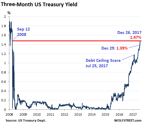
The price of three-month Treasury securities fell and the yield — which moves in the opposite direction — rose, ending the year at 1.39%, after having spiked to 1.47% on December 26, the highest since September 12, 2008. This is in the upper half of the Fed’s new target range for the federal funds rate (1.25% to 1.50%). Back in October 2015, the yield was still at 0%:
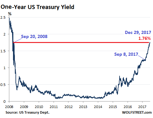
The Fed is tightening, and clearly, this end of the Treasury market believes it. The one-year Treasury yield rose to 1.76% on Thursday, and stayed there on Friday, the highest since September 20, 2008. It had fallen as low as 0.1% in 2011 and 2014. Note the nearly uninterrupted spike since September 8, 2017. Mid-September was when the QE Unwind transitioned from vague idea to a scheduled series of events:
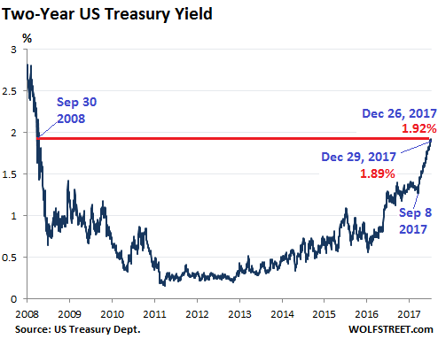
The two-year yield hit 1.92% on Tuesday, the highest since Sep 30, 2008, and ended the year at 1.89%. Note the nearly uninterrupted spike since September 8:
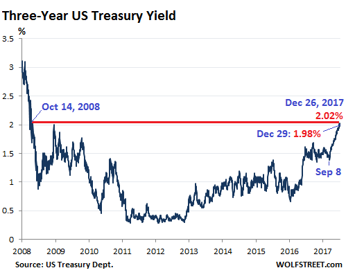
At this end of the yield curve, the market is convinced that the Fed is tightening, and it isn’t fighting the Fed, it’s responding to it, with prices falling and yields rising. But with maturities of three years and higher, a cacophony has broken out, with longer-term yields spending most of 2017 defying the Fed. This too has changed since September 8 with the three-year yield. It has now formed a spike of its own. This is new, and it shows that the believers in Fed-tightening are moving up the curve, perhaps taking the QE Unwind a little more seriously. On Tuesday, the three-year yield hit 2.02%, the highest since October 14, 2008, and ended the year at 1.98%:
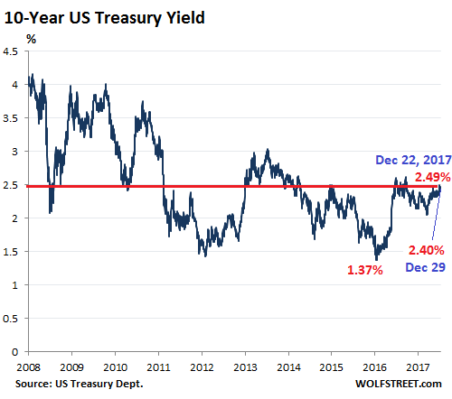
Even the 10-year yield has ticked up lethargically over the past few weeks, reaching 2.49% on December 22. That’s still down from earlier this year when it flirted with yields above 2.6%. But it’s the highest since March 16, and it’s up by over a full percentage point from the historic low of 1.37% in August 2016. The 10-year yield closed the year at 2.40%:
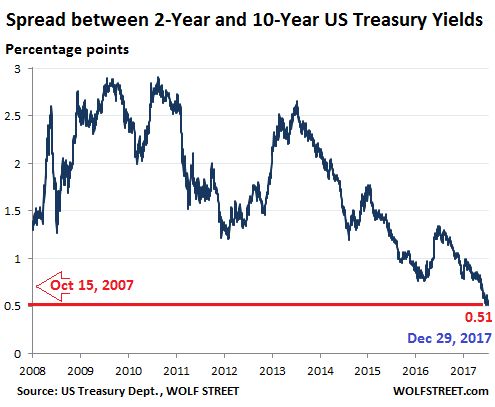
But it wasn’t enough. Most of the time, the 10-year yield is significantly higher than the two-year yield. But occasionally, the spread between them narrows toward zero and eventually becomes negative, with the 10-year yield lower than the two-year yield. This condition has proven to be an ominous precursor. And it’s at it again, to the point where the narrowing spread between these two yields has made its way onto the Fed’s worry list. That spread collapsed to 0.51 percentage points on December 15, and also ended the year at 0.51%, the lowest since October 15, 2007:
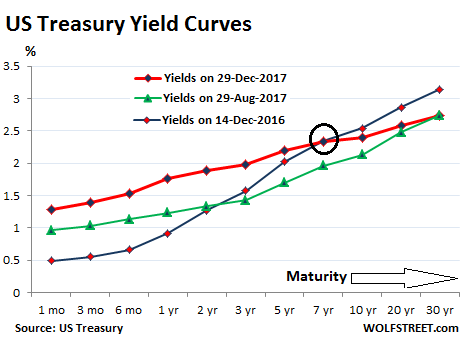
Back in October 2007, the spread was widening after having been negative in late 2006 and early 2007 as part of an “inverted” yield curve. Not much later, the Financial Crisis cracked the veneer of the banks. The chart below shows the yields across the spectrum for three dates:
Two things stand out: One, the red line (yields on Friday) has “flattened” compared to the blue line (yields on December 14, 2016), with short-term yields (left side of the chart) rising in response to the Fed, even as yields of seven-year maturities and longer (right side of chart) have fallen. This is the flattening yield curve everyone is worried about. And two, the relationship between the red line and the green line (yields on August 29, 2017) shows that the very long end – the 30-year yield – has stopped falling since the end of August, and all other yields have risen, with the mid-section rising the most. This includes the recent surge in the three-year yield noted above. Even the seven-year yield (circled in black) is now above its level on December 14, 2016 – for the first time since March. This means that, even while the spread between the two-year and the 10-year has narrowed further, the middle of the curve – not just the short end of the curve – is now making baby steps in responding to the Fed’s rate moves and the QE Unwind. In other words, the believers in “Fed tightening” are creeping up the curve. These baby steps in that direction are likely to continue: note the signs that the 10-year yield is starting to respond with its own baby steps. During the prior incidents of an inverted yield curve, the Fed did not sit on $2.45 trillion of Treasury securities and $1.76 trillion of mortgage-backed securities. Back then, the Fed had no effective tools to get the market to push up long-term yields. Today it has those tools: the QE Unwind. The Fed’s “balance sheet normalization” will accelerate as 2018 progresses: In Q1, the Fed is scheduled to shed $60 billion in securities, in Q2 $90 billion, in Q3 $120 billion, and in Q4 $150 billion, for a total of $420 billion. This is scheduled to increase to $600 billion in 2019. And if the Fed wants to spook the markets into jacking up long-term yields, it could accelerate further its “balance sheet normalization.” For the first time in history, the Fed can actually do something that will drive up long-term yields. It has already started to do that ever so gingerly with the first steps of the QE Unwind in Q4 2017. The market seems to be responding, equally gingerly, by selling off longer-dated maturities – the mid-range of the curve – and pushing up yields. This is where 2017 ends. 2018 will likely be the year when the effects of the Fed’s “balance sheet normalization” appear more clearly – including a yield curve that will change course, and instead of inverting, will start to tilt up at the long end, as longer-dated bonds are starting to sell off, in line with the moves at the shorter end. This would put to rest the fears about an inverted yield curve, but the selloff in longer-dated Treasuries would be a painful experience for coddled bondholders. Leverage is the great accelerator on the way up – and on the way down. Read… Peak Good Times? Stock Market Risk Spikes to New High
|
Send this article to a friend:
 |
 |
 |

![[Most Recent Quotes from www.kitco.com]](http://www.kitconet.com/charts/metals/gold/t24_au_en_usoz_2.gif)
![[Most Recent USD from www.kitco.com]](http://www.weblinks247.com/indexes/idx24_usd_en_2.gif)
![[Most Recent Quotes from www.kitco.com]](http://www.kitconet.com/charts/metals/silver/t24_ag_en_usoz_2.gif)